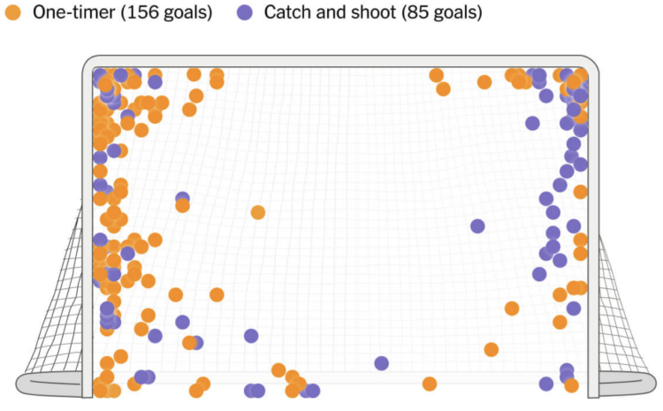
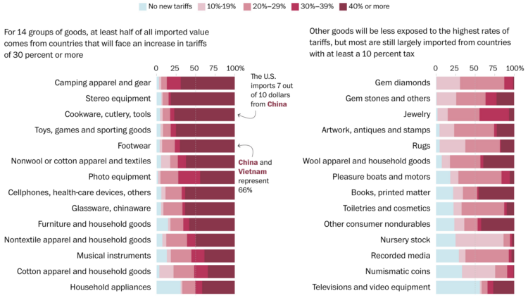
• Alex Ovechkin passed Wayne Gretzky’s all-time goals record with number 895. For The Athletic, Dom Luszczyszyn highlights “Ovechkin’s spot” on the ice (paywalled), where he scored 285 of his career goals.

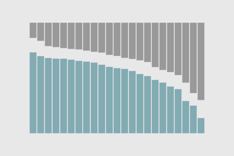
    After watching every goal Ovechkin has ever scored from his spot, what became clear is how often he made damn sure that the goalie had absolutely no shot at stopping what was coming. Even with a gaping net facing him, Ovechkin would very often put pucks as far out of reach from a goalie’s potential grasp. These were perfectly placed shots, as if Ovechkin was picking corners on an invisible goalie in front of him. The frequency that one of his goals was laser-focused on just inside the post-crossbar connection was astounding.

    I know very little about hockey other than whatever knowledge I gained through osmosis living in Buffalo, New York for a few years. But I appreciated this statistical breakdown and the dots that look like cupcake sprinkles.

  • The Metropolitan Transportation Authority in New York is rolling out an updated subway map that trades geographic accuracy for readability and ease of use.
    Read More

  • For Associated Press, Fatima Hussein reports:

    The acting commissioner of the Internal Revenue Service is resigning over a deal to share immigrants’ tax data with Immigration and Customs Enforcement for the purpose of identifying and deporting people illegally in the U.S., according to two people familiar with the decision.

    Melanie Krause, who had served as acting head since February, will step down over the new data-sharing document signed Monday by Treasury Secretary Scott Bessent and Homeland Security Secretary Kristi Noem. The agreement will allow ICE to submit names and addresses of immigrants inside the U.S. illegally to the IRS for cross-verification against tax records.

    There are laws that threaten fines and prison time for just accessing IRS data from outside agencies. This seems upside down.

  • Members Only

    With data, we can zoom out. Gather context, get the big picture, and filter out the noise.

  • New to me, Anime.js by Julian Garnier seems like a fun library to play with.

    Anime.js is a fast, multipurpose and lightweight JavaScript animation library with a simple, yet powerful API. It works with CSS properties, SVG, DOM attributes and JavaScript Objects.

    The 4.0 version was just released.

  • Stock markets dropped in value this week, and it seems there is more turbulence ahead. So households are seeing the value of their savings decrease significantly over a short period of time.

    Perhaps now is a good time to look at value from a long-term perspective.

  • Washington Post Opinion has a tracker updated weekly that groups items by everyday events, such as breakfast, a B.L.T. sandwich, or a backyard barbecue.

    Inflation, no longer just a concept discussed at abstract economic levels, is now felt directly in everyone’s receipts at the grocery store. Promises were made last year that the prices would come down. The prices continue to rise fast enough for you to notice. We’ll see where they go.

    See also: InflataCart, an inflation tracker for your grocery list.

  • You get a tariff. And you get a tariff. And you. And you. Everybody gets a tariff. But not the same for every type of consumer good. For the Washington Post, Luis Melgar, Rachel Lerman, and Szu Yu Chen show the percentages of imported value by category.

    That means products that the United States commonly gets from Vietnam, such as clothing and shoes, would be subject to a new 46 percent tax, whereas goods from Colombia, like flowers, would see a lower new 10 percent levy. Imports from Mexico, such as avocados, will have no new tax. In any case, shopping is about to get more expensive for Americans.

    It looks like camping gear, stereo equipment, cookware, and toys are going to get hit the hardest, but at least numismatic (?) coins won’t get taxed as hard.

  • Trade Partnership Worldwide, based on data from the Census Bureau, estimates $714 billion in new tariffs, which will be spread differently for each country. Lazaro Gamio for the New York Times reports:

    As companies and consumers will largely bear the higher cost of importing goods, Mr. Trump’s trade policies could come with a large economic toll. Consumer sentiment has begun to fall, inflation is expected to rise, and global stocks have been plunging. Even Mr. Trump has suggested that his policies could cause a recession.

    Nevertheless, Mr. Trump suggested on Wednesday that more trade actions could follow.

  • Based on data from the Survey of Consumer Finances, 58% of families have money in the stock market, either directly or through mutual funds or retirement accounts. The percentage has been rising over the decades. Pew Research broke it down by race since 1989:

    The stock market used to be an investment vehicle primarily for the wealthy, but it’s gotten easier and finances have shifted. The recent tariff-induced downturn is hitting everyone now, directly and indirectly.

  • With Streets to Stability, Crankstart illustrates a plan to reduce homelessness in San Francisco:

    This report outlines 12 specific recommendations to improve the way people enter the system, the services they receive, and the overall management and support required to help them. If implemented, these changes would allow San Francisco to better support those at risk of losing their accommodations or living on the streets.

    Everyone deserves lasting stability, particularly those who have historically faced barriers due to racial inequities and economic marginalization. Making this happen will require clear delineation of the responsibilities of government and service providers, with fewer hurdles and black holes. By embracing a clear, results-driven approach, inefficiencies can be reduced, and progress can be made.

    The report leans heavily on conceptual graphics to illustrate the plans, which makes the complex systems easier to understand.

  • One might assume decisions that swing economies worldwide were based on careful research and calculations. That appears to not be the case with the administration’s recent tariffs, as first pointed out by James Surowiecki:

    Just figured out where these fake tariff rates come from. They didn’t actually calculate tariff rates + non-tariff barriers, as they say they did. Instead, for every country, they just took our trade deficit with that country and divided it by the country’s exports to us.

    So we have a $17.9 billion trade deficit with Indonesia. Its exports to us are $28 billion. $17.9/$28 = 64%, which Trump claims is the tariff rate Indonesia charges us. What extraordinary nonsense this is.

    The administration, which did not provide insight into how the rates were calculated for trade on a global scale, eventually confirmed the above. They provide a formula with math symbols, perhaps to seem more official, but it amounts to a spreadsheet calculation between two columns.

    They deemed real estimates to be too complex. So they printed a table with big numbers and called it reciprocal. It combines the Faker and the Descriptor from the DADC.

  • Members Only

    When bars are stacked, we can see shifts in composition, but the layout can also make it harder to see patterns individually. Let’s look at our options.

  • The Wall Street Journal has a handful of charts that briefly explain trade deficits and imbalance, which were used to calculate the recent “liberation” tariffs.

    A trade deficit is the difference between the value of the goods and services a country imports and the value of goods and services it exports. A deficit means that a country is importing more than it exports. A surplus means the opposite. Economists sometimes examine the total trade balance—goods and services—and sometimes analyze just goods or services trade. Services include transportation, construction and the provision of accounting or legal support. The White House’s tariff analysis appeared to include only goods, not services.

  • As you might expect, there is a big income difference between those with college degrees and those with none. But there’s been a shift lately. For Bloomberg Businessweek, Dorothy Gambrell and Marie Patino show the breakdowns by age, generation, and race.

    In 2023, the last year for which data is available, 25- to 34-year-olds with a bachelor’s degree earned exactly 200%—or twice as much—as people from the same cohort without one did. That’s a nice chunk of change, sure, but as more of the population earns a degree, that premium is getting smaller. In 1960 young adults with a degree saw the premium in their earning power peak at 237%.

  • Two-hit wonders are in between the obscure one-hit wonders and famous musicians. Chris Dalla Riva looked for the greatest, defining a two-hit wonder as an artist/group that had a top to hit and at least one top 30.

    This list is kind of shocking. Pink Floyd, one of the best-selling bands of all-time, is a two-hit wonder? By the definition, I just outlined, yes. Pink Floyd’s albums always did better than their singles, though. In fact, Pink Floyd might be the platonic form of artists on the list. They are mostly in the rock universe and sell more albums than singles.

    There are also other artists on the list that are typically classed as one-hit wonders. a-ha is a good example of this. Most known for their 1984 smash “Take On Me,” they technically landed another hit in the top 30: “The Sun Always Shines on T.V.” Additionally, outside the U.S. they had many other hits, but the Billboard Hot 100 is focused on American sales and streams.

    Now do three-hit!

  • Some people sneeze very loudly. For the Washington Post, Teddy Amenabar, Álvaro Valiño, and Artur Galocha used animated illustrations to show what brings that on, along with tips on how to sneeze quietly.

  • Maggie Appleton is at the point in her pregnancy when there’s a lot of waiting, so she’s her downtime to look at pregnancy statistics. Based on a 2001 study, she made an interactive chart that lets you enter a due date to see the probability that the baby is born on a given day.

    Taking key metrics from that, I made a tiny tool that shows a probability distribution graph of spontaneous labour starting on each day of your pregnancy. I’ve found this helped ground my expectations of when babies normally tend to arrive, and how long I can wait until I need to start worrying about induction. You can enter your own due date, and whether you’re a first-time mum, to see your own stats.

  • The Science & Community Impacts Mapping Project (SCIMap) estimates the impact of proposed funding cuts to the National Institutes of Health (NIH) across the United States:

    We source our data from a public database of NIH grants that were active in 2024. We estimate the economic impact of NIH grants (or reductions in NIH funding) based on a recent report, which found that every dollar invested in NIH generated $2.56 in new economic activity in 2024. To estimate the number of jobs that would be lost if NIH funding is cut, we used the ratio of the number of jobs supported / research funds awarded in the 2024 fiscal year. We also use Census data on where U.S. commuters live and work to estimate how economic activity generated in each county can spread to adjacent counties.

    Nationally, the estimates sum to $16 billion and 68,000 jobs lost. This is in addition to lost research and advances in science, of course.

  • Secret Base offers a much too complete history of slipping on banana peels, dating back to May 28, 1867.

    Beware of banana peels. They are capable of inflicting great physical harm. Even worse, they might own you so badly that you’ll need to make a 33-minute documentary about them several years later simply to purge yourself of the abject shame and humiliation.

    As Jon Bois narrates, a map and timeline show the place and time of each documented incident. A running tally for the types and affected body area supplies the cumulative totals.
    Read More